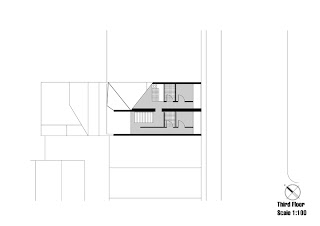
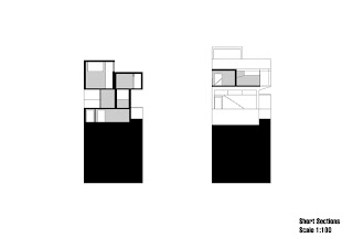
For my final design I looked further out at the surrounding streetscape to see how that responded to the cliff that cuts through Potts Point. As the curving rock face clashes with the city grid it creates a number of seemingly random but interesting spaces. I wanted to incorporate this in to my final design by getting the two apartments of the art collector and artist to juxtapose one another much like the city grid and the rock face. The resulting negative space forms the space for my galley. By not actively designing the gallery space and instead letting the surrounding architectural articulation do all the work, is to me the purest form of adapting to the site.
The
articulation between the artist and art collector’s apartments was guided by
the thought of mutual collaboration. The Arts collector needs the artist to
supply works of art for his gallery, but artist needs the financial supports of
the arts collector. They are in a sense dependent on one another and their
lives revolve around the gallery. I therefor positioned their apartments in a
supportive posture around the gallery, where the architectural articulation appears
to be sheltering that space. As the
artist and the arts collector are so reliant on one another, the architecture
is designed to support both apartments. This is illustrated in the structural
design. They both enter through a common staircase that bares the load of the eastern
side of the building. On the western side of the building, a structural element
from Rem Koolhaas Maison á Bordeaux has been added to support the weight of the
building but still have the feel of it floating above the gallery. Although the
apartments are of different size, where the art collectors is the bigger, they
both sit at the same height, giving the assumption that they are in a sense
equal and dependent on one another.
The lowest
floor houses a public garden the ground floor the gallery space, office small display
room and storage. The first floor an intermediary
space partly glazed in from shoulder level and upwards which allows the inhabitants
to respond to the street but still allows for privacy (like walking around
naked if one chooses to). The third floor houses the lower floor of the art
collector’s residence featuring a kitchen, dining area, lounge room and balcony.
The fourth floor houses the sleeping quarters, laundry and bathroom of the arts
collector but also the artist residence.
The program
goes from public in the lower garden, to semi private in the gallery, to a higher
level of privacy in the intermediary floor to fully private in the top floors. This
compartmentalization is essential in all of Koolhaas designs.
Ceiling
heights is something Koolhaas very subtly uses to control space. In the ground
floor, the ceiling height is very low to enhance the feeling of moving underground
into the mountain. Light in this area is provided by a light well facing the
street. This works well in responding to the surrounding buildings, as light
wells are an old a common way of getting light to the lower floors. This is
design is also found in the buildings surrounding the site. As we move upwards
in the structure, ceiling heights successively grow to provide a more airy and
light feeling.
The
circulation is managed through a series of ramps that respond to the neighboring
buildings. Through those ramps, you can access the lower public garden and the semi-private
gallery. To further explore the building, you in a sense have to be invited in
by the owners, as the three upper floors can only be accessed through the
galley space. Having both the arts collector and artist enter and leave by first
transitioning through the gallery space adds to the quality of life for the
inhabitants as the artist can supply fresh works of art in the morning that the
arts collector can enjoy on his way to and from work.
Something
that I really wanted to incorporate in the design is Koolhaas was of controlling
views. For my design I wanted the view of the Sydney skyline to be restricted
from street level forcing people down the ramp to be able to access it. This
also provides privacy as it shelters the inhabitants from insight from a westerly
direction. This way of stepping down to access a view relates to the stepping
down motion behind Victoria St towards Woolloomooloo where the site is located.
This is also apparent in the upper two floors. In the art collectors’
residence, he first has to step down to the third floor to be able to access a
view of the Sydney skyline and the gallery space below. In the artists residence the skyline and
gallery space below is visible due to a higher ceiling height and a large
glazed window, but by looking down he is also awarded a view of the art
collectors lounge room, dining room and kitchen. This sharing of views exposes
their personal lives to one another and suggests a very intimate relationship
between the two, which I believe can only better the artistic exchange. This is
further reinforced by the shared staircase and laundry facilities. However,
this level of shared privacy forces the arts collector to carefully consider
the personality of the artist I residence.


